How to Generate Critical CSS Automatically: A Step-by-Step Playbook
If a mobile page takes more than three seconds to load, 53% of visits are lost. Google’s advice emphasizes speedier loading through fast paint techniques. Critical CSS helps by inlining just enough CSS to render the first screen, making pages load instantly and improving scores.
This guide is for US teams looking to use our Critical CSS Generator tool for optimizing their sites. It’s about speeding up page load times, raising SEO rankings, and bettering Core Web Vitals. This is done by cutting down render-blocking resources and delaying the rest until they’re needed.
To start, you just paste a URL into the generator, hit Generate, then inline the critical CSS in your website’s head. After that, you should load the rest of the CSS in a way that doesn’t block the page. This method makes your site faster, focusing on quick First Contentful Paint (FCP) and Largest Contentful Paint (LCP) without causing layout shifts.
We will share easy methods, recommend a limit on inlined CSS, and show you how to check your improvements. Tools like PageSpeed Insights, Lighthouse, and WebPageTest will be used. By following our guidance, you’ll be able to automate this process across your site, keeping your team in sync and your site loading quickly.

Generate Critical CSS now. Just paste a URL to get critical CSS ready for production within seconds.
Key Takeaways
- Inline only above the fold css to speed up FCP and LCP.
- Use criticalcssgenerator.com to generate critical css and extract critical css fast.
- Load the full stylesheet non‑blocking with preload and a safe swap pattern.
- Keep the inline bundle small to optimize website speed and web performance.
- Validate gains with Lighthouse, PageSpeed Insights, and WebPageTest.
- Apply critical path css workflows per page or template to scale.
- Act now to improve page speed and boost seo ranking across your site.
Why Critical CSS Matters for Faster Page Speed and SEO
When browsers download and parse CSS, pages can’t show anything. Big or late styles mean blank pages and jumpy layouts. This bad for FCP, LCP, and Core Web Vitals. Using inline critical CSS rules makes the first view quick to load. Then, the rest loads without slowing things down.
This way, your site’s speed and performance get better without big sacrifices. Keeping inline CSS small—3–14 KB gzipped—makes pages load faster. It’s great for users with slow internet.
This strategy also boosts scores in Lighthouse and PageSpeed Insights. Critical CSS helps your SEO by avoiding CSS that slows down your site. It keeps your pages interactive and loads them faster.
Managing font loading is key. Use only critical fonts and choose options to avoid font loading issues. This helps pages stay stable and keeps LCP scores high while making your site faster.
Aim to keep things simple. Minimize @import files and focus on key website areas. Doing this reduces delays and speeds up loading times on all devices.

What Critical CSS Is and What to Include Above the Fold
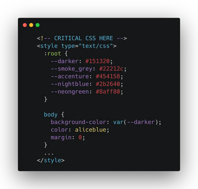
Critical CSS makes the first screen load quickly. It includes essential styles like the header, main text, and basic layout elements. It makes sure the site’s colors and general look appear instantly.
Leave out styles not seen right away, such as the footer and pop-up elements. This approach reduces unnecessary load time. It helps your site load the main content faster.
Make sure to use simple font rules and colors at the start. This prevents text from vanishing and colors from changing unexpectedly. Keep the critical CSS small and focused for an instant page feel.
If your pages vary greatly, tailor the critical CSS for each one. This fine-tunes loading times while keeping the work manageable. For small sites, one CSS file may be enough for quick loading.

- Include: header/nav layout, hero media wrappers, base typography, buttons in view, and key grid rules.
- Exclude: footer styles, carousels below the fold, off-canvas panels, and deferred widgets.
- Guardrails: reduce css render blocking, create critical css that fits inlined limits, and ship optimized css delivery.
| Element | Include in Critical CSS | Reason | Notes |
|---|---|---|---|
| Header & Navigation | Yes | Stabilizes layout at first paint | Keep spacing, logo size, and link states minimal |
| Hero Section | Yes | Often the LCP element | Specify aspect ratios to avoid shifts |
| Base Typography | Yes | Prevents FOUT/FOIT and reflow | Use fallback stacks and font-display |
| Grid/Columns in View | Yes | Locks structure for above-the-fold content | Only the grid rules needed for the first screen |
| Color Scheme Tokens | Yes | Avoids light/dark flicker | Define root variables early |
| Footer Styles | No | Not visible at first paint | Load with the main stylesheet |
| Modals & Menus (Open State) | No | Rare initial state | Defer until interaction |
| Full Component Library | No | Inflates bytes and delays paint | Split and load on demand |
Use this checklist to focus on critical CSS. It reduces load time and ensures your site is quick and responsive. This strategy avoids unnecessary slowdowns.
Step-by-Step: Paste URL → Generate → Copy → Inline → Load Full CSS Non‑Blocking
Start with criticalcssgenerator.com to simplify your workflow. It optimizes CSS delivery and stops render-blocking CSS. This method makes websites load faster.
Step 1: Paste the page URL you’re focusing on.
Step 2: Hit the generate button. This tool looks at your content and viewport. It quickens your site with critical CSS, showing what users first see.
Step 3: Copy what it gives you. Keep the important bits for the top of the page to make CSS load quicker. You should aim for 10–14 KB gz.
Step 4: Place the critical CSS in the part of the head section. Make sure to set aside space for main images to avoid layout shifts. Also, preload an important WOFF2 font and select font-display: swap or optional. Use crossorigin for fonts on different origins.
Step 5: Load the rest of the CSS without blocking. Follow a safe method: preload then switch or use media=print. Always have a noscript link as a backup for when JavaScript isn’t running. This avoids layout flashes and keeps CSS delivery smooth.
Once you’ve added the critical CSS, check your site with Lighthouse for “Eliminate render‑blocking resources.” This confirms improvements in LCP and FCP. It shows you’ve created lasting critical CSS, enhanced CSS loading times, and built a faster website for everyday use.
Here’s a tip: preload the whole stylesheet, change it on load, and offer a noscript link just in case. This trick creates a faster site with critical CSS. It works well on browsers like Safari, Chrome, Firefox, and Edge.
Don’t wait: Generate your Critical CSS now. Just paste a URL and receive your Critical CSS in seconds.
generate critical css, critical css generator, extract critical css, critical cs
Use criticalcssgenerator.com to make critical css for each key route. This tool runs a headless render and then cuts styles to just above-the-fold rules. This supports efficient critical css making so you can inline a small block and put off the rest.
Begin with your home, pricing, article, and product pages. Running per-route captures critical css that fits the real content and layout exactly. This accuracy keeps the inline part quick and reduces render-blocking when the page first loads.
Keep your css bundle small. After pulling out critical css, use tools like Lighthouse and DevTools Coverage to check the size. Remove animations and long transitions if possible. A focused critical css block is always better than a large one.
Choose the right tools. Some critical css tools put too much inline; others miss important styles. A good css tool should get fonts, layout, and key colors right without needing to load everything. Aim for a critical css tool that is minimal, exact, and easy to use over and over.
For teams, make a quick checklist: use the critical css tool, check coverage, see speed changes, then go live. Do this again after big changes. This keeps your critical css effective over time.
Next step: boost page speed with critical css—pick the best method and inline the results now.
Implementation Patterns for Static Sites and Popular CMS
For static sites, start by putting a small, essential style block in the head. Then, delay the main /assets/app.css by using preload along with media=print swap. Include a noscript stylesheet so users without JavaScript can still see the styles. These steps make css load better and keep css delivery smooth.
Use tools like Vite or Rollup and add a PostCSS pipeline and safe shrinking with Lightning CSS. Store external CSS with hashed filenames and unchangeable headers to enhance css performance. These methods shorten transfer times and lessen layout shifts.
In cms setups, add the critical css directly in global header fields, theme head spots, or across the site in code. Then load the full css in a way that doesn’t block. WordPress, Shopify, and Drupal all fit with this method. This ensures the css delivery remains steady no matter the template.
For SPAs, embed a tiny app shell for the header, hero, and foundational styles. Then, load CSS for specific routes without blocking. For SSR frameworks like Next.js and others, put it directly in server HTML. This avoids stopping the first paint. Only preload fonts that you see right away and use font-display: swap or optional.
When working with Tailwind, activate purge and keep the rest as a regular stylesheet loaded asynchronously. This strikes a balance in css optimization with solid coverage on detailed pages.
To improve css performance on a large scale, mix hashed builds, careful preloading, and delivery that knows the routes. These strategies assist both static and cms setups in loading css well and keeping the design true.
Workflows That Scale: Per-Page, Per-Template, and Team Batches
Start with something simple. Get going by sending a single global inline block all over your site. This is your first step to make your website faster. When your site’s design starts to change, focus on the areas where making it even a tad quicker is crucial. These steps use critical CSS to speed up your website and cut down load times safely.
Then, divide the tasks based on the type of page. For important marketing pages and promotions, use critical CSS that’s specific to each page. When dealing with the home page, blogs, products, and categories, apply critical CSS based on the template. This method keeps a minimal base globally. Then, it allows for a bit more code for each specific part to keep everything streamlined.
Put your main effort into pages that either get a lot of visits or are not performing well in terms of speed or income. Use tools like criticalcssgenerator.com to pull out what you need quickly. Then, place the critical CSS right in the page’s code and delay loading the rest. This helps you make the site faster while the code review remains manageable.
Remember to account for changes at the top of the page. Things like A/B testing, ads, and personalized content can affect what loads first. Update your styles regularly to keep up with these changes. This way, your site stays fast, even when there are new elements or shifts in content. Small, consistent updates help maintain a quick and smooth loading experience.
For larger scale improvements, work as a team. Make lists of tasks, divide them among your team, and launch updates together. Use tools like Coverage screenshots and Lighthouse reports to make sure everything looks good earlier on. This process of checking and updating helps maintain a fast site speed through critical CSS on numerous pages.
| Workflow Model | Best Use | How It Helps | QA Artifacts | Notes |
|---|---|---|---|---|
| Global Inline Base | Site-wide shared header, nav, shell | Fast setup to start optimizing website speed | Lighthouse before/after, filmstrip | Keep small; layer deltas later |
| Per-Template Critical CSS | Home, blog, product, category | Improves consistency and reduce page load time across families | Coverage screenshots per template | One snippet serves many URLs |
| Per-Page Critical CSS | Campaigns and top traffic pages | Max gains where every ms counts | LCP deltas, filmstrip proof | Use tiny deltas to limit HTML size |
| Team Batch Releases | Large sets of URLs in sprints | Scalable team workflows with predictable rollouts | Checklist: Coverage, Lighthouse, diffs | Assign, paste, verify, then merge |
Production-Ready Loading Patterns and CSS Optimization Techniques
Get your site to load super fast with smart CSS tricks. Start by preloading your main CSS with rel=preload, then switch it to rel=stylesheet when it loads. Don’t forget a noscript fallback for those without JavaScript. For wider compatibility, the media=print trick is reliable and straightforward.
If your CSS file is small, like 10–14 KB after compression, stick to one main link. Smaller CSS files often work better than multiple requests. For bigger styles, load essential styles first and split the rest by page. This way, your site looks good instantly, without delay.
First, make your CSS files smaller by getting rid of unused styles and compressing them. Avoid using @import because it slows down your site. Tools like Google Lighthouse and webpack help automate optimizing CSS while keeping it effective.
Fonts are key. Only preload the fonts you need right away, and choose font-display: swap or optional to avoid layout shifts. Matching line height and spacing helps keep your page looking good as fonts load. These changes significantly improve how fast your website feels.
background-image wisely so your site doesn’t get held up waiting for CSS. Set aspect ratios early to prevent layout changes, then load other images when needed. This makes your site load faster and look good sooner.
For tight security, add a unique nonce or hash to your CSS. Update your stylesheet with a new filename and cache settings to speed up repeat visits. Keeping critical CSS inline with your HTML ensures fast loading without sacrificing security or efficiency.
- Non‑blocking patterns: media=print swap, rel=preload plus onload swap, or one small blocking sheet when gzipped size is tiny.
- Trim weight: css minification, purge unused rules, and reduce css file size with targeted bundles.
- Defer safely: lazy load below‑the‑fold CSS and split by route to honor best critical css practices.
- Tighten fonts: preload ATF only, use font-display, and metric‑compatible fallbacks.
- Harden delivery: CSP nonce/hash for inline critical and cache with hashed assets.
Integrate CSS optimization checks into your CI process to keep file sizes in check. Keep an eye on key performance metrics to make sure your site stays fast for all visitors.
QA and Iteration: Validate, Measure, and Refresh
Start by creating essential CSS and put it directly in your HTML. Use Chrome DevTools Coverage to spot any CSS rules that aren’t used during the initial load. This approach reduces resources that slow down the page loading.
Next, use Lighthouse in Chrome and PageSpeed Insights to enhance page speed. After each adjustment, compare new audits with the previous ones. Focus on improving CSS efficiency while ensuring that the user interface remains stable and loads quickly.
Then, open WebPageTest and look at the page’s loading visuals. Make sure Start Render times are quick and fonts aren’t holding back text display. Adjust the critical CSS and use preload for only what’s absolutely necessary if you notice any gaps.
Monitor actual user experiences with the web‑vitals library in real-world conditions. Keep an eye on p75 LCP and CLS scores to make sure performance improvements are effective. This action aligns page speed enhancements with the browsing habits of real users.
To maintain clean results, follow these guidelines: reduce the size of large inline styles, set aside space for large images or videos, provide a backup for when JavaScript isn’t available, and embed crucial dark-mode styles directly. These measures prevent slowdowns while keeping the layout stable.
Update your CSS regularly, especially when there are changes to the top part of your site, fonts, or main images. By doing so, you ensure the CSS remains optimized. Start with pages that get a lot of visits or bring in revenue before making widespread changes.
- DevTools Coverage: confirm unused CSS at first paint.
- Lighthouse testing: verify improved audits and measure LCP shifts.
- WebPageTest: validate Start Render and filmstrip continuity.
- Field data: monitor p75 LCP/CLS to guide page speed optimization.
- Maintenance: schedule regular updates to improve page speed with critical css.
Conclusion
A lean, well-scoped critical CSS block speeds up the first paint. It works by only inlining what’s needed above the fold. Aim for about 3–14 KB gz, and use preload plus async for the rest. This method reduces render-blocking and makes pages load faster. It also boosts seo by improving LCP. Plus, it works for all kinds of websites.
Focus on the important details. Only preload the first text font, preferring swap or optional. Make sure media above the fold doesn’t shift around to avoid CLS. By caching external CSS and allowing HTML to recheck, updates become quicker. These steps keep critical css fast and easy to manage.
Start by adding it in the head through themes or templates. Then, scale it up: extract it page by page or template by template. Use batch processes for larger libraries. Check your work with tools like Chrome DevTools, Lighthouse, and WebPageTest. Refresh the inline block when the ATF content changes. This approach ensures your site loads quickly and remains fast, boosting your seo across various devices.
Want to get started? Visit Critical CSS now. Just paste a URL to receive a scoped block quickly. This will help speed up your site and improve your seo by using critical css. It targets LCP and ensures optimized css delivery.